A simple digital keyboard with an intuitive interface that even beginners can use.
Minimal
An entry-level instrument with a simple, friendly form that lets both adult and child alike experience the joy of playing for the first time.
Honest
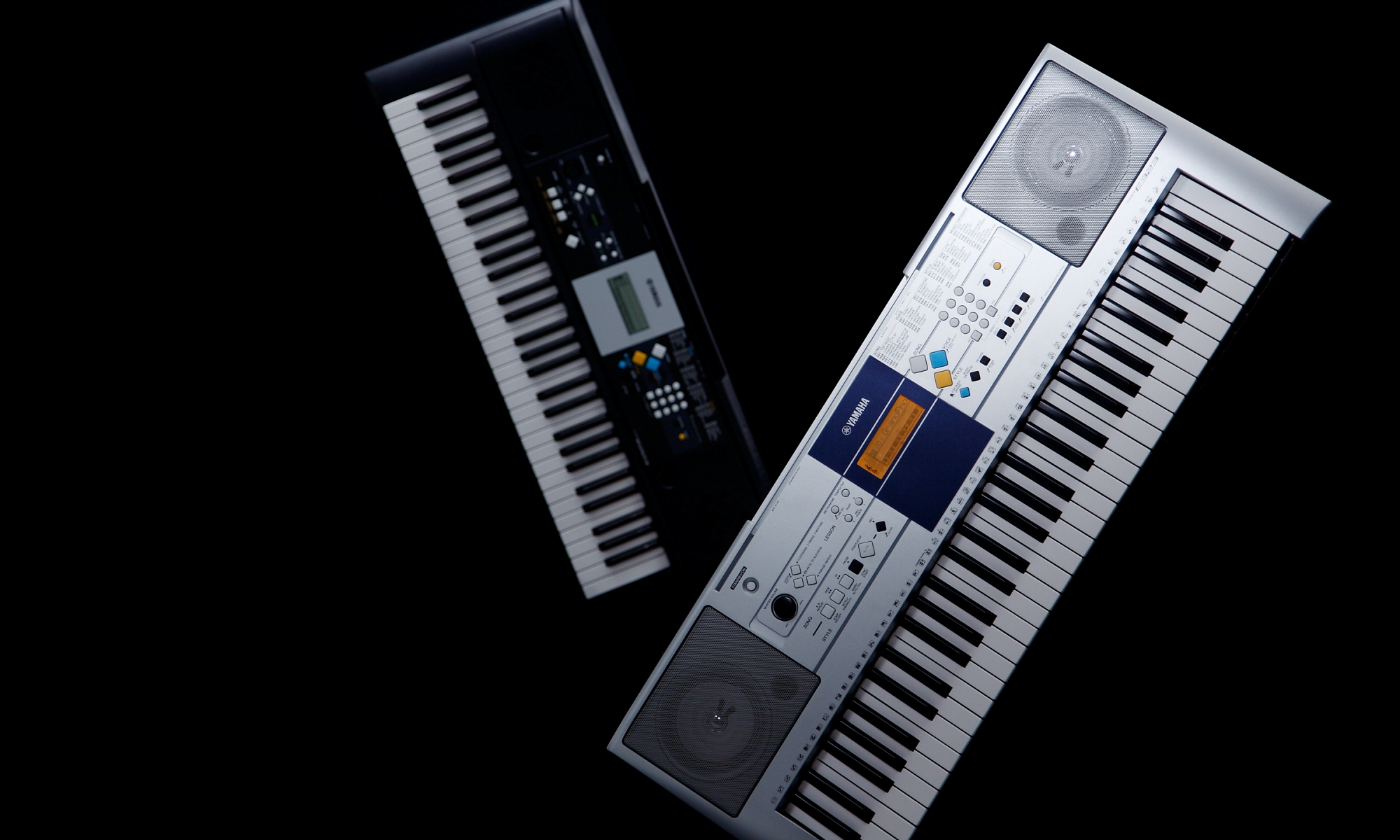
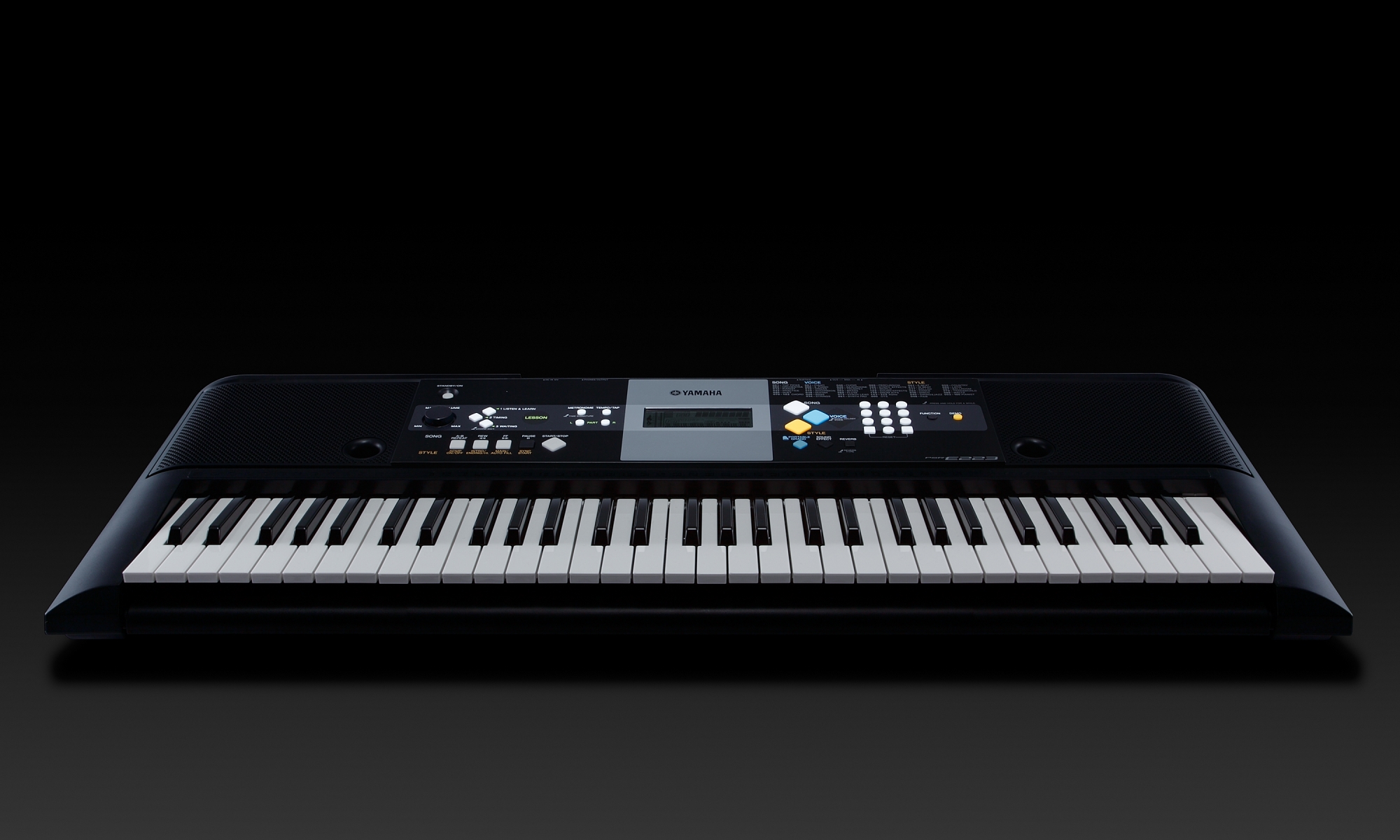
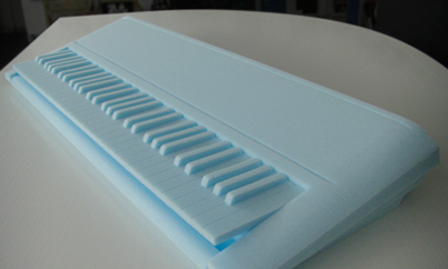
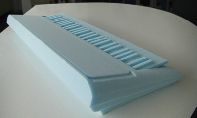
The body has been given a reserved presence, inviting the eye to the central operations panel. Both the left and right sides of the instrument have been cut back dramatically for much slimmed-down look, so that the panel screen appears to be floating at the center of the body.
Instantly-usable
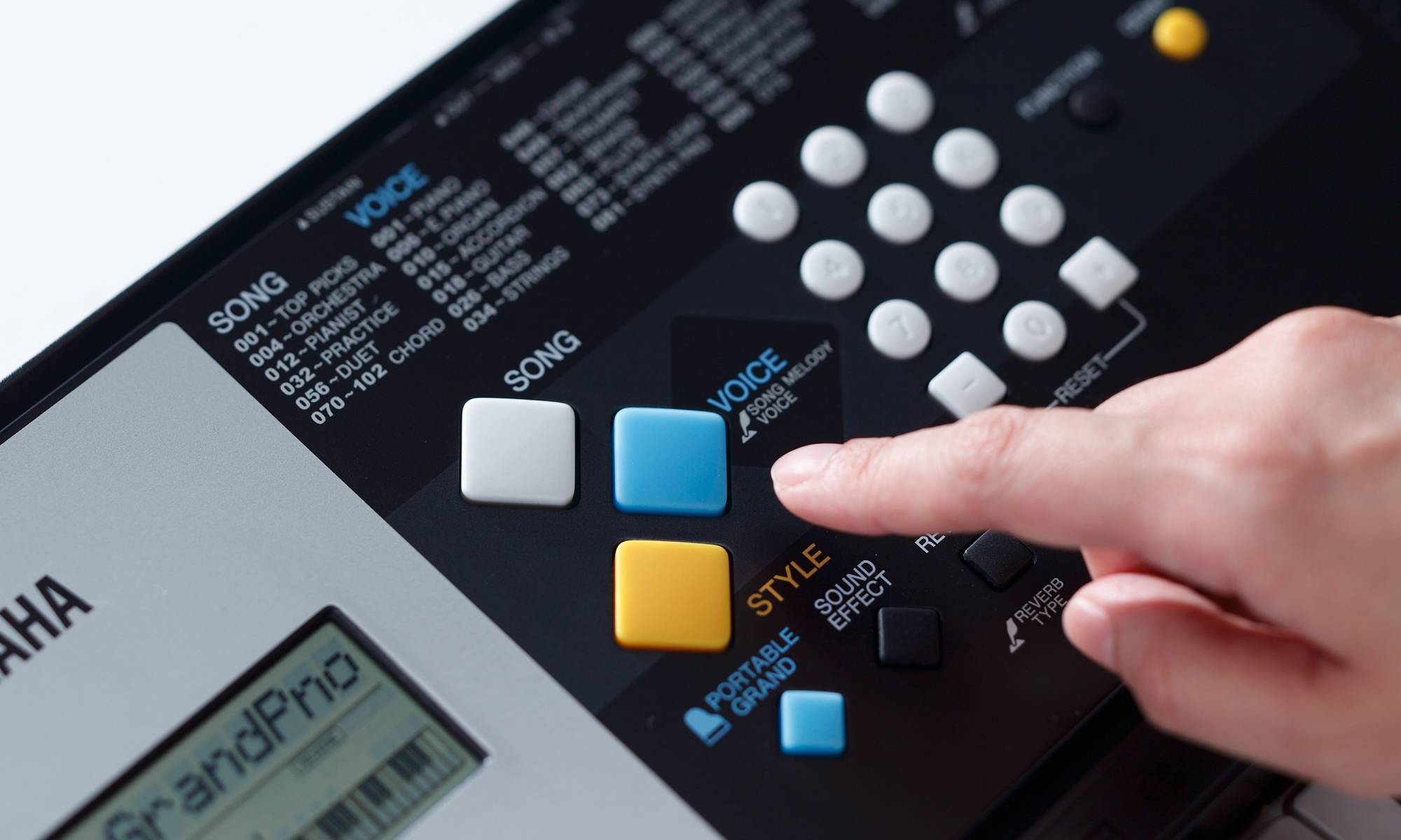
With large, colorful buttons patterned after building blocks to catch the eye, this multi-functional design offers a wealth of enjoyment at the push of a button, and feels great to the touch.
Intuitive
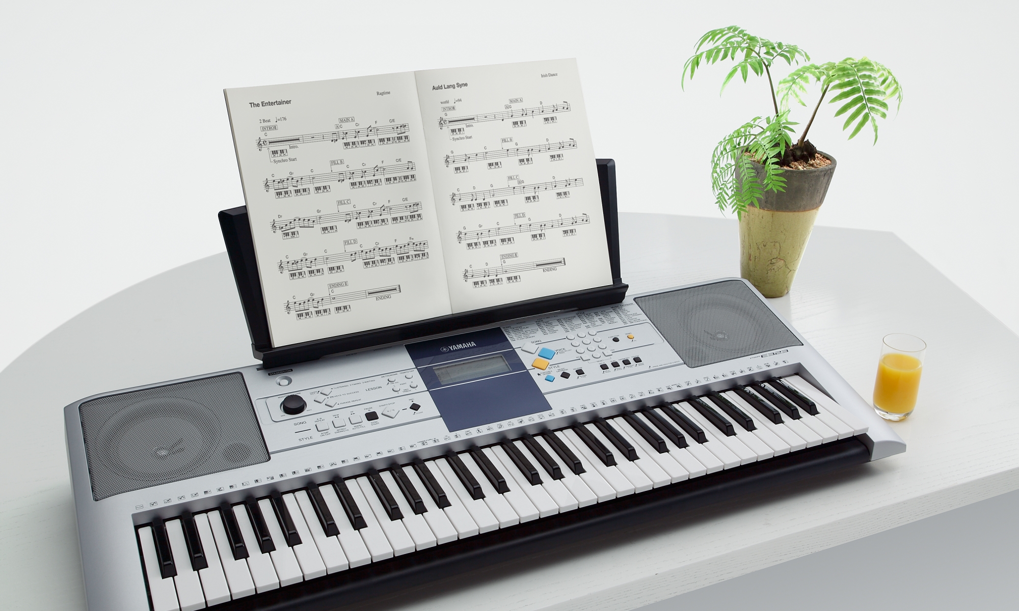
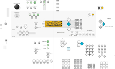
The panel is divided into nine different zones, for intuitive use of the instruments many functions. The layout emphasizes user-friendliness, as evidenced by the accompaniment buttons that have been laid out on the left side of the console for easy access with the left hand when performing.
Toshihide Suzuki
Designer
Yamaha Design Laboratory
Designing for "Ease of Use"
The PSR-E323 / E223 digital keyboards let even beginning plays taste the joy of playing music. Since the instruments come with a range of tones and accompaniments as well as a lesson function, we devoted ourselves to creating an interface that lets the player enjoy performing without any effort. To that end, we first put ourselves in the player's position, test-playing existing keyboards exhaustively. This brought us to the realization that aspects such as switch positioning almost never lent themselves to intuitive use when seen through the eyes of a novice. Functional though these instruments were, they lacked the appeal needed to charm the player.
We threw ourselves into the search for an interface that would look good and be easy to use. One of the solutions that emerged was to establish cross zones on the panel, in addition to the horizontal color divisions and partitioning characteristic to Yamaha keyboards. We then arrayed the elements of the interface according to purpose, into areas for sound and song selection, accompaniment playback, and lesson functions. For example, we placed the play / stop button for the auto-accompaniment in from of the player’s left hand, for easy operation while the right hand plays the melody. Conversely, the right side of the instrument is reserved for sound and song selection, and features lists of sounds and songs displayed where the player can see them with minimal eye movement.
We also looked at the design of each and every button. Take, for example, the simple shape, reminiscent of a child’s building blocks. Adding these elements to the design gave it an endearing quality that makes you want to reach out and touch it. We also put a great deal of effort into details such as how the buttons feel to push, and curved all the surfaces that the player's fingers are likely to touch.
Our goal for this design was to go beyond the exterior of the instrument, achieve an ease of use that allows anyone to enjoy playing it. I believe that is a vital aspect of product design.