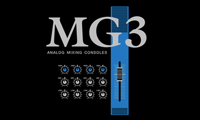
The third generation of the MG Series has been visually updated, with black as its body color and blue as the accent color, to tie the series together and organize the controls visually. The step between the I/O panel and the control panel segregates the mixer into functional zones, while a special forming process that bends the surface after printing creates a seamless appearance overall. Channel numbers are printed on the step’s riser for enhanced visual recognition.
We designed the new generation of the MG Series starting with a blank sheet of paper. We used a tough metal chassis that connects the front surface to the rear. Plastic side pads are attached to a durable body to make it easier to carry.
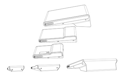
The MG Series encompasses ten models in five sizes to suit a wide range of applications. These condense functionality and controls into the most compact package possible, with a unified design that carries through every model in the series.
Mixer knobs are color-coded to indicate their function at a glance. The MG Series uses primary colors for maximum visibility in dark environments. The panel surface is printed with fine-grained graduations, and knobs are marked with indicator lines top and bottom, allowing the operator to make adjustments more precisely than ever.
Yves Plattard
Designer
Yamaha Design Laboratory
The descendant, ascendant.
These mixers are the third generation in the MG Series. In redesigning a series where the bones are already well established, we had to make sure we carried forward what was great about it and improve on that.
And this generation is definitely a descendent of the MG Series. One way it shows is in the blue that we used as the accent color on the control panel and I/O panel. Previous iterations of the MG Series have used a dark blue as the main color on the upper panel, and this has become an identifying trait for the series; in the third generation, we chose black as the base color for both the upper panel and body, and used a vivid, contrasting blue to divide the control panel into zones and carry on the “blue for MG” association. The functional, high-contrast panel also has improved visibility on a darkened stage.
Of all the improvements, solidity is the most important. The second generation of the MG Series mostly used plastic for its chassis, apart from the upper surface, but the third generation now features an all-metal chassis apart from plastic side pads. This makes it more solid, more durable, and gives it a more professional feel. The upper panel also uses a special process that Yamaha developed for the CL series, where the sheet metal is formed after it is printed. This made it possible to divide the I/O panel and control panel into distinct zones on different levels and print without joints at the channel line, so that the channel numbers are printed directly onto the raised, angled surface. This makes the information easier to take in and improves usability.
The MG Series is already a best-seller, with many fans around the world, so there was a steep hurdle to overcome when redesigning it. In this case, we decided what we wanted to carry forward and what we wanted to improve, and then we focused on making those changes really great. It should go without saying that this involved a lot of people other than designers—it involved developers, managers, and others—and all of us were very strongly motivated to take a best-seller and make it better than ever. We put our best work into it, and I think we got our best work out of it.
![[Thumbnail]](/en/tech-design/design/insights/id_066/images/pict_01.jpg)
![[Thumbnail]](/en/tech-design/design/insights/id_066/images/pict_02.jpg)
![[Thumbnail]](/en/tech-design/design/insights/id_066/images/pict_03.jpg)
![[Thumbnail]](/en/tech-design/design/insights/id_066/images/pict_04.jpg)