Comprehensive image and signage plan for the flagship store.
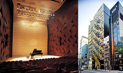
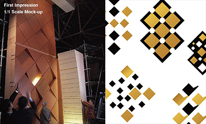
The oblique latticework of the facade evokes a Japanese aesthetic, while at the same time echoing the acoustically functional design of the wall pattern in Yamaha Hall. Glass panels are overlaid with variegated shades of gold leaf and laid out on the wall with a rhythm that expresses the timelessness and musicality of the Ginza.
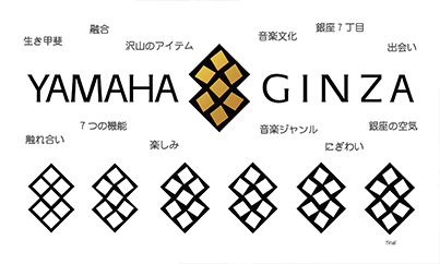
The logo takes the oblique lattice design of the building’s exterior and of the walls of Yamaha Hall, and makes that the symbol of the building. The central diamond angled at 45° with other diamonds at random angles express a musical dynamism and the liveliness of a gathering spot.
Consistent typography and a simple design free of all unnecessary elements serve both the function of being easy to read and of conveying the sophistication of the Ginza.
A coherent design logic unifies the building facade, the first-floor portal, and the interior trim on every floor—designed to resonate with the neighborhood of the Ginza and to be an inviting place where people gather together around music.
Nobumasa Tanaka
Designer
Yamaha Design Laboratory
Harmony with the Ginza and a sense of excitement.
The previous Yamaha Ginza building was completed shortly after the end of the war, in 1951, and while many people came to love it over the half century that followed, that location was renewed in February 2010 to become Yamaha’s flagship store. The Yamaha Design Laboratory took charge of the visual identity for the entire Yamaha Ginza building. Our goal for the visual identity of the Yamaha Ginza building was to express the excitement of a place where people gather together around music. We were also trying to harmonize with the Ginza, as a sophisticated neighborhood for adults.
Our visual-identity program began with work on the logo. We wanted the logo to be something that anyone would instantly recognize as the mark of the Yamaha Ginza building, and we took as the design motif the oblique lattice of the Yamaha Hall walls, which was developed for its superior acoustic properties. We used seven diamonds in the lattice—in a nod to the building’s location in the Ginza’s seventh district—and placed the diamonds outside the center at random angles to signify the rhythm of music. The oblique-lattice design motif serves a central role in the visual identity as the symbol of the Yamaha Ginza building. The Visual Identity initiative covers all of the visual aspects related to the building, and is carried through to the interior trim on each floor, the selections of furnishings, the production of signboards located at the entryway to each floor, and even printed material, including programs for concerts in Yamaha Hall and business cards. Most recently, we produced a logo for the Ginza Opera, an opera recital with performances on an Electone organ. These all benefit from a unified design identity, and are an important way to keep and elevate the Yamaha Ginza building in the public perception.
Visual identity conveys character by visualizing a specific shape and giving everyone a focused point of reference for what would otherwise be a vague impression. With the visual identity for the Yamaha Ginza building, we are building on the strong connection between Yamaha and the Ginza to create an image that will be even better loved than before, and which will come to be known by still more people.
![[Thumbnail]](/en/tech-design/design/insights/id_060/images/pict_01.jpg)
![[Thumbnail]](/en/tech-design/design/insights/id_060/images/pict_02.jpg)
![[Thumbnail]](/en/tech-design/design/insights/id_060/images/pict_03.jpg)
![[Thumbnail]](/en/tech-design/design/insights/id_060/images/pict_04.jpg)